One way to estimate expected inflation is to look at the pricing of various securities. The government sells several types of securities that mature over a number of different time frames. To estimate what investors expect inflation to be over a given period you can look at the interest rate they charge on constant maturity securities versus inflation adjusted securities.
By subtracting the interest rate on constant maturity securities from inflation indexed securities you determine the premium that investors require in exchange for uncertainty of not knowing what inflation will be in the future. If investors expect higher inflation then they will demand a higher interest rate so that their returns aren't wiped out by inflation.
So by looking at the spread between these securities you can get a picture of what investors expect inflation to average over the lifetime of the securities.
Here are the data for 5 year constant maturity and inflation-indexed securities:
These graphs show the difference between the two securities, or the expected average 5 year inflation:
The rate as of 7/29 is 2.07%, and the average rate over the last 6 months is 2.11%.
Tuesday, August 2, 2011
Friday, July 29, 2011
A Puzzle? GDP Productivity and Employment to Population Ratio
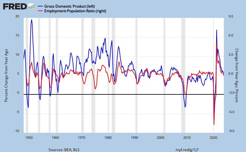
Something I haven't seen in a comparison before is the relative change in GDP to the relative change in the employment to population ratio. With all the talk of structural versus non-structural unemployment, PSST versus low aggregate demand, and the liquidity trap versus NGDP targeting, I figured I would take a look at the historical relationship between relative changes in GDP and relative changes in the employment to population ratio.
Here's what the Federal Reserve Bank of St. Louis shows as the GDP/Employment relationship:
I didn't run any stats on the correlation because, well, I didn't have enough time on my lunch break, and because the graph is clear enough: GDP is highly correlated with the employment to population ratio, especially over the last 30 years.
I wanted to look closer at trends, so I graphed each of the series separately, along with their 20 year running averages. You'll notice that the average rate of growth of each has been declining for the last few decades.
Subscribe to:
Posts (Atom)


